#mobileweb
#web
#Figma
Streamlining Patient Access at Northwell Health
Streamlining Patient Access at Northwell Health
Streamlining Patient Access at Northwell Health
Streamlining Patient Access at Northwell Health
Streamlining Patient Access at Northwell Health
Streamlining Patient Access at Northwell Health
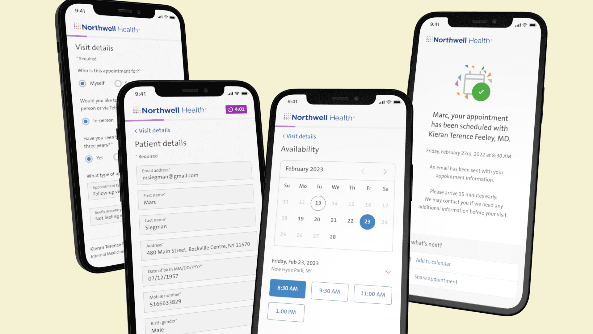
Redesigned Northwell Health's booking system to prioritize user ease and efficiency, significantly reducing abandonment and streamlining the patient experience.
Redesigned Northwell Health's booking system to prioritize user ease and efficiency, significantly reducing abandonment and streamlining the patient experience.
Redesigned Northwell Health's booking system to prioritize user ease and efficiency, significantly reducing abandonment and streamlining the patient experience.
Redesigned Northwell Health's booking system to prioritize user ease and efficiency, significantly reducing abandonment and streamlining the patient experience.
Redesigned Northwell Health's booking system to prioritize user ease and efficiency, significantly reducing abandonment and streamlining the patient experience.
Redesigned Northwell Health's booking system to prioritize user ease and efficiency, significantly reducing abandonment and streamlining the patient experience.
June 2022-August 2023
Timeline
Lead Designer
Role
June 2022-August 2023
Timeline
Lead Designer
Role
Background
Background
We noticed Northwell Health's appointment system was driving users away with its required account setup and a clutter of questions, making the whole experience clunky. So, we rolled up our sleeves to simplify the process, aiming to make booking appointments a breeze and keep users happily coming back.
We noticed Northwell Health's appointment system was driving users away with its required account setup and a clutter of questions, making the whole experience clunky. So, we rolled up our sleeves to simplify the process, aiming to make booking appointments a breeze and keep users happily coming back.
Challenge
Challenge
When our team took on the website alongside the app, it was clear we had our work cut out for us. With competitors offering guest bookings and our user satisfaction at just 49%, we needed to do more than just catch up. Faced with a 60% booking abandonment rate, our team quickly set to work, eager to understand and improve the existing system.
When our team took on the website alongside the app, it was clear we had our work cut out for us. With competitors offering guest bookings and our user satisfaction at just 49%, we needed to do more than just catch up. Faced with a 60% booking abandonment rate, our team quickly set to work, eager to understand and improve the existing system.
Approach
Approach
1
Understanding the patient experience
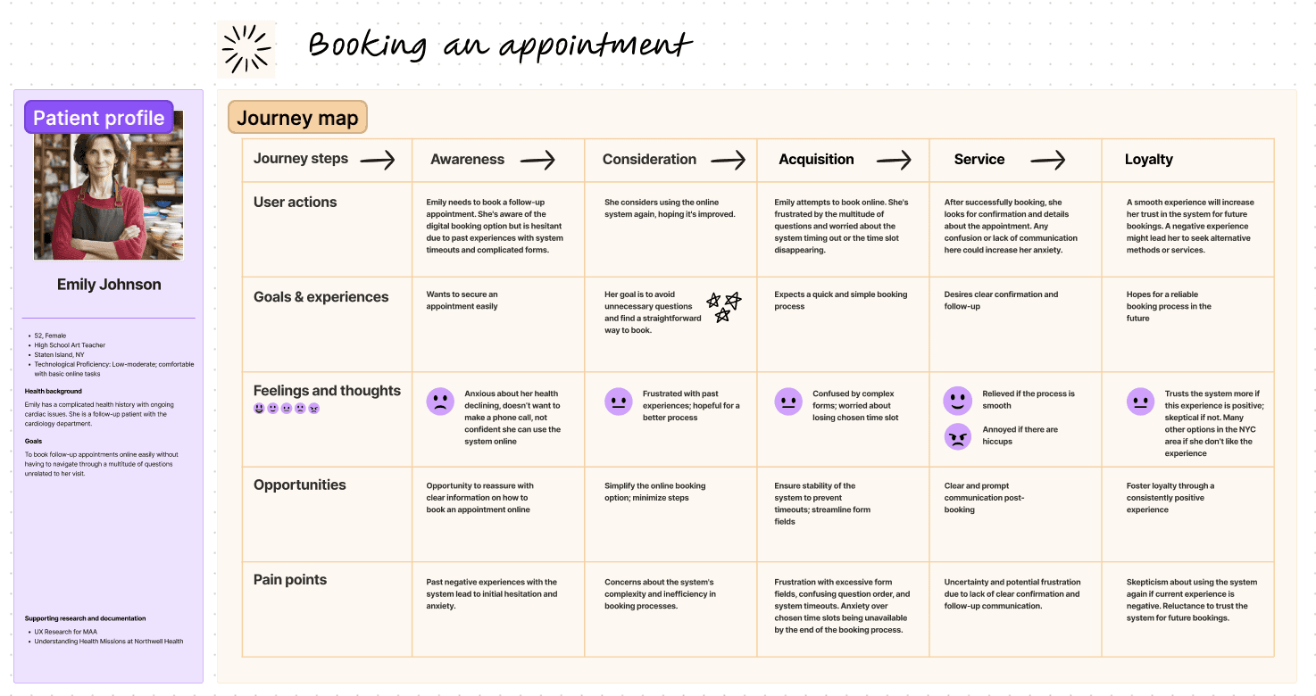
Our first step was to map the patient's entire journey, from deciding to book an appointment to the follow-up. We focused on visualizing their path and pinpointing key touchpoints and pain points. Tools & Artifacts: We used Figjam for collaborative journey mapping. These maps illuminated user frustration and confusion, guiding our redesign strategy.
2
Evaluate the existing booking experience
Our evaluations revealed a concerning 36% accessibility rate and a near-fail on the heuristic evaluation. It was clear that a complete overhaul was necessary – a fresh start to transform and elevate the user experience.
2
Evaluate the existing booking experience
Our evaluations revealed a concerning 36% accessibility rate and a near-fail on the heuristic evaluation. It was clear that a complete overhaul was necessary – a fresh start to transform and elevate the user experience.
2
Evaluate the existing booking experience
Our evaluations revealed a concerning 36% accessibility rate and a near-fail on the heuristic evaluation. It was clear that a complete overhaul was necessary – a fresh start to transform and elevate the user experience.
3
Design & build reusable components
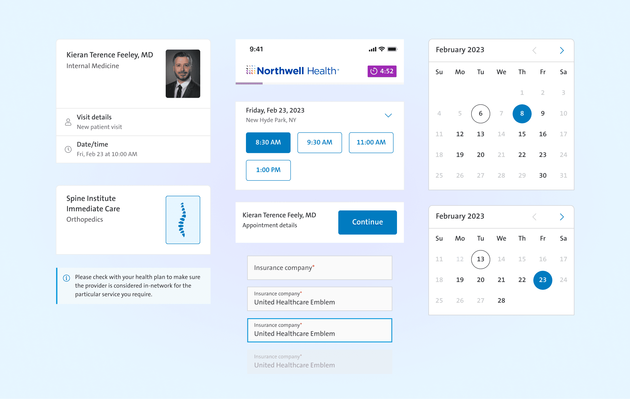
As we expanded to web, we aimed to create reusable web components, leveraging our existing mobile app library where possible. We selected key components like calendars, buttons, navigation, and progress bars, and collaborated closely with developers to optimize the design and development sequence.
Complicated health history with cardiac issues. Follow-up patient. Moderate technological proficiency. Wants to book an appointment easily and without having to go through a multitude of questions.

Emily Johnson
52, Female
Generally healthy, seeking an ER on Demand visit for a suspected UTI. Graduate student, savvy tech user. Wants to be able to book an appointment without the hassle of creating an account.

Alex Martinez
24, Male
A retail manager with limited tech skills, Martha usually books appointments by phone. Intrigued by an ad in her doctor's office, she's considering trying online booking but feels overwhelmed by complex digital systems.

Martha Simmons
57, Female
Looking to establish care with a Family Medicine doctor. Is a Software Engineer, so his expectations of digital interactions are that they are intuitive and efficent.

Michael Thompson
38, Male
Strategy
Strategy
Our strategy was deeply informed by thorough user research and grounded in UX design best practices. We meticulously mapped the patient's journey and crafted detailed user flows, uncovering key pain points and bottlenecks that were causing users to abandon the booking process.
Our strategy was deeply informed by thorough user research and grounded in UX design best practices. We meticulously mapped the patient's journey and crafted detailed user flows, uncovering key pain points and bottlenecks that were causing users to abandon the booking process.


Complicated health history with cardiac issues. Follow-up patient. Moderate technological proficiency. Wants to book an appointment easily and without having to go through a multitude of questions.

Emily Johnson
52, Female
Looking to establish care with a Family Medicine doctor. Is a Software Engineer, so his expectations of digital interactions are that they are intuitive and efficent.

Michael Thompson
38, Male
Generally healthy, seeking an ER on Demand visit for a suspected UTI. Graduate student, savvy tech user. Wants to be able to book an appointment without the hassle of creating an account.

Alex Martinez
24, Male
A retail manager with limited tech skills, Martha usually books appointments by phone. Intrigued by an ad in her doctor's office, she's considering trying online booking but feels overwhelmed by complex digital systems.

Martha Simmons
57, Female
Personas
Personas
Complicated health history with cardiac issues. Follow-up patient. Moderate technological proficiency. Wants to book an appointment easily and without having to go through a multitude of questions.

Emily Johnson
52, Female
Looking to establish care with a Family Medicine doctor. Is a Software Engineer, so his expectations of digital interactions are that they are intuitive and efficent.

Michael Thompson
38, Male
Generally healthy, seeking an ER on Demand visit for a suspected UTI. Graduate student, savvy tech user. Wants to be able to book an appointment without the hassle of creating an account.

Alex Martinez
24, Male
A retail manager with limited tech skills, Martha usually books appointments by phone. Intrigued by an ad in her doctor's office, she's considering trying online booking but feels overwhelmed by complex digital systems.

Martha Simmons
57, Female
User Research
User Research
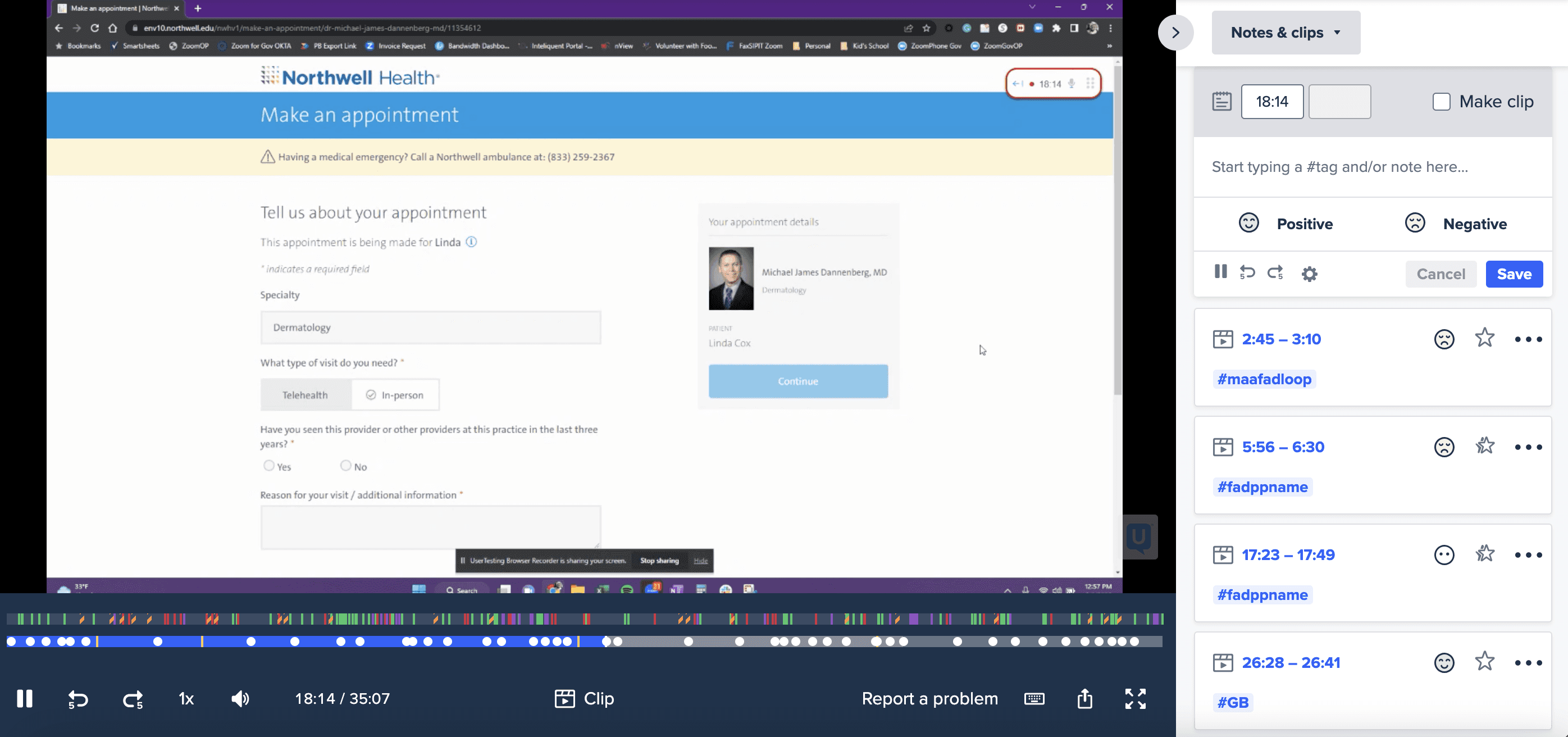
We dove into our current booking system to see where it was falling short. We tested with 20 people ages 18-65, ranging in technological ability, all who've booked appointments online or by phone. Here's what one person had to say about how it stacks up against other booking experiences they've had:
We dove into our current booking system to see where it was falling short. We tested with 20 people ages 18-65, ranging in technological ability, all who've booked appointments online or by phone. Here's what one person had to say about how it stacks up against other booking experiences they've had:
"The current flow is just too confusing, with too many questions. It's frustrating when the time slot I pick initially isn't available by the time I'm booking. And the calendar format? It's not user-friendly at all."

Justin B
34, Male
"The current flow is just too confusing, with too many questions. It's frustrating when the time slot I pick initially isn't available by the time I'm booking. And the calendar format? It's not user-friendly at all."

Justin B
34, Male
"The current flow is just too confusing, with too many questions. It's frustrating when the time slot I pick initially isn't available by the time I'm booking. And the calendar format? It's not user-friendly at all."

Justin B
34, Male
"The current flow is just too confusing, with too many questions. It's frustrating when the time slot I pick initially isn't available by the time I'm booking. And the calendar format? It's not user-friendly at all."

Justin B
34, Male
Design Iterations
Design Iterations
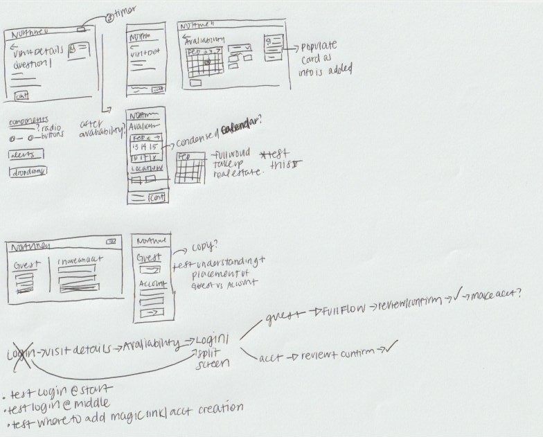
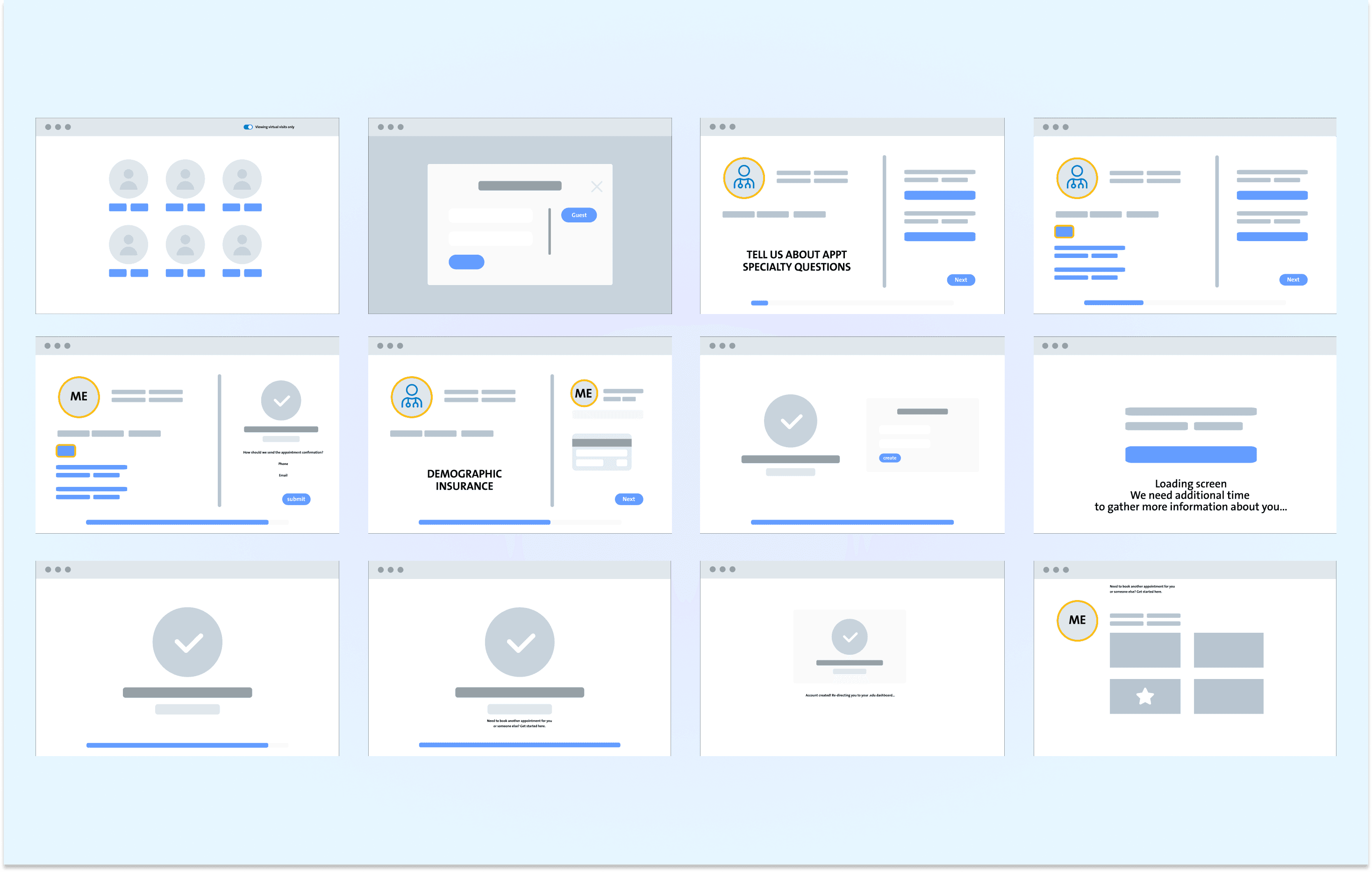
We translated our findings into sketches and wireframes, rapidly prototyping solutions. Each iteration was user-tested, ensuring our design decisions were data-driven and user-validated.
We translated our findings into sketches and wireframes, rapidly prototyping solutions. Each iteration was user-tested, ensuring our design decisions were data-driven and user-validated.
Solutions & Results
Solutions & Results
1
Make an appointment on web and mobile web
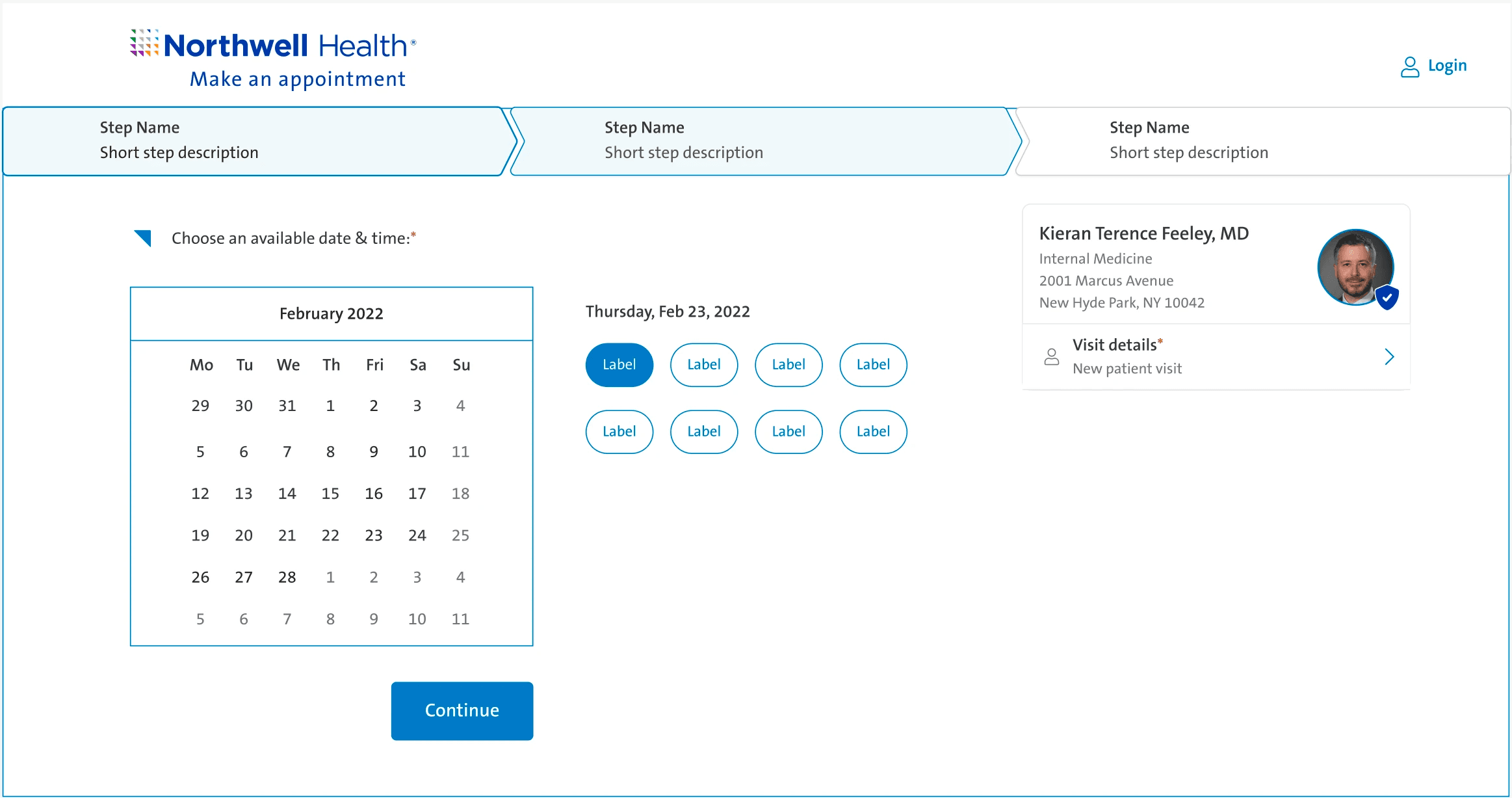
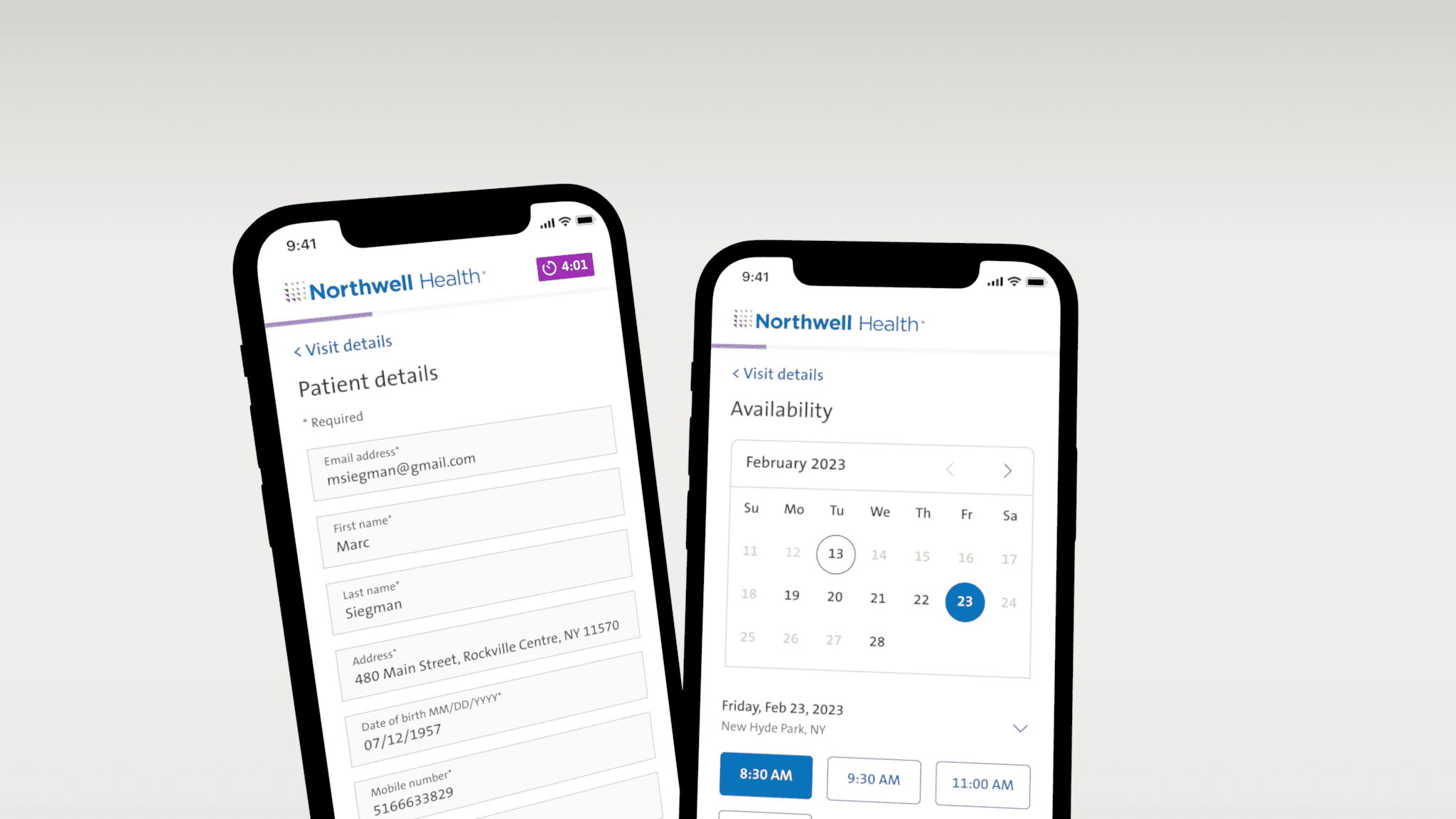
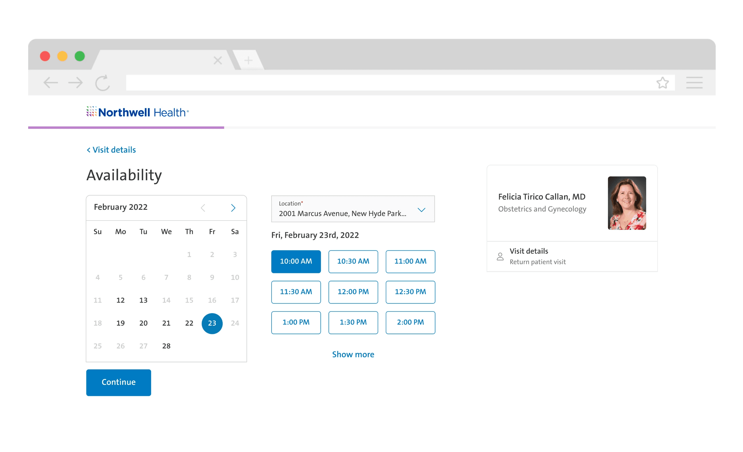
The new system introduced a streamlined guest booking option, reducing steps to appointment completion. We redesigned the UI to be intuitive, crafting a clear, concise path to booking.
1
Make an appointment on web and mobile web
The new system introduced a streamlined guest booking option, reducing steps to appointment completion. We redesigned the UI to be intuitive, crafting a clear, concise path to booking.
1
Make an appointment on web and mobile web
The new system introduced a streamlined guest booking option, reducing steps to appointment completion. We redesigned the UI to be intuitive, crafting a clear, concise path to booking.
2
Storybook implementation
Our diverse team of me as the UX designer, developers, and project managers worked in unison to turn our designs into reality. We developed reusable components in Storybook, laying the foundation for a robust web design system for future projects.
2
Storybook implementation
Our diverse team of me as the UX designer, developers, and project managers worked in unison to turn our designs into reality. We developed reusable components in Storybook, laying the foundation for a robust web design system for future projects.
2
Storybook implementation
Our diverse team of me as the UX designer, developers, and project managers worked in unison to turn our designs into reality. We developed reusable components in Storybook, laying the foundation for a robust web design system for future projects.
3
Accessibility rose from 36% to 99%
After launching the new system, we ran another round of user testing. Satisfaction rates shot up to 80%. The remaining gap in satisfaction was linked not to our booking flow, but to challenges with the 'Find a Doctor' search feature. Meanwhile, our booking abandonment rate dropped significantly, and completed bookings surged, highlighting the system's success. Impressively, the accessibility rate jumped from 36% to an impressive 99%, a testament to our focused efforts on inclusive design.
Next Steps
Moving forward, we plan to address the 'Find a Doctor' search feature to enhance overall user satisfaction. We'll continue refining the booking system based on ongoing user feedback and analytics, ensuring we maintain high accessibility standards. Further A/B testing and iterative design improvements will keep us aligned with evolving user needs and industry advancements.
Personas
Personas
Complicated health history with cardiac issues. Follow-up patient. Moderate technological proficiency. Wants to book an appointment easily and without having to go through a multitude of questions.

Emily Johnson
52, Female
Generally healthy, seeking an ER on Demand visit for a suspected UTI. Graduate student, savvy tech user. Wants to be able to book an appointment without the hassle of creating an account.

Alex Martinez
24, Male
A retail manager with limited tech skills, Martha usually books appointments by phone. Intrigued by an ad in her doctor's office, she's considering trying online booking but feels overwhelmed by complex digital systems.

Martha Simmons
57, Female
Looking to establish care with a Family Medicine doctor. Is a Software Engineer, so his expectations of digital interactions are that they are intuitive and efficent.

Michael Thompson
38, Male

